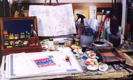
fig. 7
|
My painting table laid out for illumination. The box contains
medieval pigments in a dry powder form. The colors are laid out
in sea shells. On the right is a glazed ceramic tray for water,
and a jar of water sits behind it. The easel hold my sketches.
The palette knife I use to scoop up color rests beneath the water
tray, as do my pencil and pen. The glair sits nearby in a 35mm
film jar. Overhead a flexible lamp containing white color balanced
bulbs gives me controlled natural lighting.
Ok, now for the painting. Medieval paint was usually made up on the spot. It consisted of the binder (a glue like substance such as some kinds of tree sap called gum, or it was made from egg white, or sometimes egg yolk), mixed with color. Medieval color came in powder form, or as dyes trapped in cloth, or as powders stained with color. The color was mixed in proper proportions with the binder in sea shells or small pots/cups and used like cakes of watercolor or gouache are today. I made a medieval European version of gum arabic by going out to a plum tree and gathering some of the sap which had dried under the branches. I picked out the crud and dissolved the sap in water to make the binder. This is the equivalent of todayís watercolor paint. But I also needed another binder called glair. This one is made from the beaten white of an egg. In Cenniniís book, he talks about gilding with old glair and says it is especially sticky. I started using old glair many years ago rather than fresh glair and noticed that it lasts very well. The jar I made this painting with dates back to March, 1994. That was down to my last jar of glair in my box. In fact, I had this haunting feeling that I was going to spill it out of the 35mm film jar I keep it in. For over two weeks I kept having the strangest feeling that I needed to make some more, but I figured that was a foolish worry. Then, the night before my last day of work I was opening the jar and I fumbled it. I watched in seeming slow motion as the jar tumbled upwards, end over end over ME! The remaining precious fluid, rotted since 1994, spewing out and soaking my shirt. Well, that went into the laundry RIGHT AWAY! I made another batch that night, but fortunately it turned out that The colors I had already made up lasted until I finished the job.
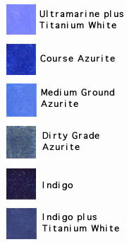
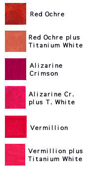
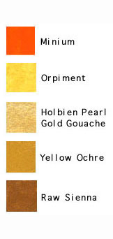
Here ís how I do it. First, I place a small amount of color in a clam shell and add a little bit of the binder. The proportions vary from pigment to pigment, as does the choice of which binder to use. Then I mix them together with a brush. Some colors which have aggregated into chunks with time need to be re-ground in binder on the slab and then transferred. It is best to test to make sure the amount of binder you have added is right. Take a sample of what you are painting on and paint out a test swatch. If it dries glossy or looks thin in pigment content, you may have too much binder. Check the dried paint by rubbing a finger on it and bending the page. If it cracks or chips off you need to correct it. You can either remix with a little less binder next time, or add the most minute amount of honey to soften it. Glossy thin color was used by choice in some medieval painting. Of course if the paint is thick and pasty it may rub off as a powder. This means you must add a bit more binder. I know a lot of illuminators who do not add enough binder to their paints, especially people who use gouache and watercolor. This is usually fine if the work is just meant for a frame, but often this paint rubs off when the work is being stored or transported in an envelope. The real problems happen when straight gouache or watercolor are used in books because from the factory they usually donít have enough binder in them to withstand the abrasiveness when used in thicknesses common in illumination. You can buy gum arabic at the store. De Arte Illuminandi describes which binders to use with which colors and why, but the reasons are for best results. I often switch them though. As long as the color doesnít rub off you are doing ok. Besides, I just donít feel like adding earwax, honey, or wine. The modern paint maker adds special ingredients to modern pigments to make them behave better. These improvements help keep colors from separating in the tubes, keep them soft and pliable, guard against freezing, maintain even gloss levels throughout a palette, etc. You just donít get that with dry pigment and eggs in a shell unless you go through the effort. Colors in Gothic painting were mixed ahead in particular hues and shades from which the whole painting would be constructed. The Gothic illuminator didnít have a large plate on which colors were mixed to infinite hues as we do with modern painting. I used seventeen different types of pigment on this painting, plus white. These yielded shells with twenty four pre-mixed colors. The extras are lighter tints of some of the pure colors made by adding white. One of the pigments, Azurite, was used in three different grades of coarseness and purity to yield three shells of very different color. Some of the colors on this palette are incompatible with each other. The two verdigris colors are acidic, and the orpiment can react with the lead colors and cause color failure and worse. For example, the outgassing of orpiment will actually cause the lead colors (I used minium) to turn metallic grey. I had to take great care not to mix these together or to place them near each other. Gothic painting used a lot of red, blue, and gold. There are differences in the pigments used for these colors, like when and where bright orange red was used instead of say, the lightened terre cotta type of red, but I chose to use some of most of the colors typical in this style. Here is a listing of the pigments I used:Please note that the colors shown are not going to reproduce exactly on your computer screen, so they should not be used for matching reference. |
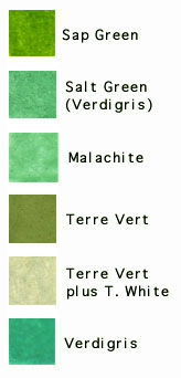

|
* Lampblack: I made this from soot I collected from a linseed oil lamp. * Titanium White: This modern color was used instead of Lead
White because I can apply it over all colors without adverse reaction.
This saves having to switch back * Red Ochre: A terre cotta like red earth color. * Yellow Ochre: I have my own, which I made from local yellow earth, but the color of the store bought stuff is darker, so I used it. * Vermilion: (Mercuric Sulfide) Very poisonous, so I got it from a chemist. * Ultramarine Blue: This is a modern synthetic version of blue from Lapis Lazuli. * Sap Green: This is a modern synthetic of the medieval color. Instead of being made from buckthorn berries, which make a color prone to fading, they use modern chemical which are weak against the sun, but not as bad as the real stuff. I generally avoid this color. * Orpiment: (Yellow Arsenic Tri-sulfide.) I ground this from
rocks, but it is very * Raw Sienna: A yellowish brown earth color. I bought this. * Terre Vert: A good, but dull green earth color. * Malachite: This color is dark when course, but I only used the pale, fine ground stuff. It is also poisonous, but very easy to make. * Azurite: I made three types of this color. The first is a dark blue almost indistinguishable in hue from ultramarine. Yet you always know it, because when you look closely you can see the coarse grit of itís particle texture. The second Azurite I used was fine ground. Like Malachite, it gets pale when ground fine. The color of my fine Azurite is like a more cerulean blue than an ultramarine. Just a bit cooler in tone. The third Azurite I used was a poor grade with impurities. I wanted a grayer tone for some of the peasant clothes, but after putting it on the food vendorís hood, I decided it was not worth using. * Indigo: I also used some indigo watercolor. Indigo hue is pretty much the same as woad, and this color was used a lot in medieval painting. * Minium: Red Lead. This color was given to me by a potter who wonít use it as a flux anymore because it is lead. It is a bright orange hue, almost like hunterís orange. * Verdigris: I used two forms of verdigris. I made one by treating copper sheets with vinegar for a few weeks. The other one was made in similar fashion, but salt was adhered to the copper with honey before being treated. The recipe was found in Theophilusí On Diverse Arts, a 12th c. Treatise on illuminating and more. * Gold: Pearl Gold Gouache which I find to be an exceptionally good imitation of real shell gold. The medieval artist had a huge variety of imitation gold paints available, so I feel no guilt about using this. |