| I began with an actual
size pen and ink sketch for the
front and back covers. This was faxed to the editor and approved.
I placed these onto a stand at my work table for reference as
I drew the design on the parchment.
In the middle ages the master who designed the page would either already have a model to base the design upon, or he would draw up a new one on a scrap page, or more likely in the black waxed surface of a wooden writing tablet (see my waxed tablet examples). The next step was to prepare the material I would work upon. I chose an 8.5x11 inch sheet of very smooth, white sheep skin parchment, imported from England for use as calligraphed certificates. I prepared it with a very light sanding by using a very fine sandpaper to raise a slight nap. This would give the paint a good purchase upon the surface. I decided upon my margin sizes, leaving plenty of white page around the design area, and marked with pin pricks where my ruling lines would be placed. Ideally, the order of laying out a book was to first plan for large areas where illustrations would be placed, but to execute the calligraphy before the painting was ìpenciledî. This was the stage where text columns would be created and written. The medieval page was ruled uniformly through the book by stacking the leaves and punching pin-prick holes through several sheets at once. These holes, near the edge of the page, indicated the spacing of columns, margins, and line height. The tool I used to prick the holes was a stylus sold as a ceramics probe. It is just a pointed wire in a wooden handle, and it is a direct parallel to the pointed wire stuck in a bone handle used in the middle ages. |
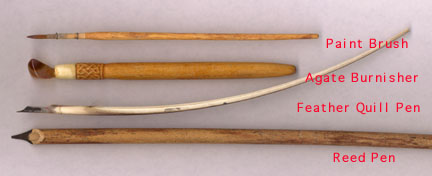
fig. 1
| Normally, the next step would be calligraphy, but the only script on this particular page is on a banderole. A Banderole is what we call those banners with words on them which often act like cartoon blurbs, relating dialogue of the illustrated characters or giving narration. Medieval calligraphy was written with either a hand dipped pen made of a reed, or a quill made from a birdís primary feather and stripped of the fletching (these tools required some special preparation and selection), or a metal quill style pen. The calligraphy was usually written with the writing surface tipped up to a steep slope so that the pen would be held in a nearly horizontal position. In this way the ink will not drop onto the page from gravity. This also helps one get a crisper, finer line. |
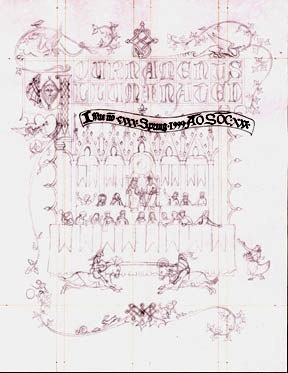
fig. 2
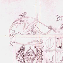
fig. 3
|
The upper left 3 inch square showing amount of detail in drawing and the inked ruling lines. Note the pin-pricked holes near the edge. The second step was to draw a fairly complete linear rendering of the design (see fig. 2) with what a medieval craftsman called a crayon. The medieval crayon was much like a pencil, being made of hardened pigment paste, and so I used a .5 mm 2h pencil to emulate it. Lead styluses were also used in the middle ages to mark a metallic grey line. The next medieval step would have been to finalize the lines with ink, but I skipped that step on this one to save time. With modern kneaded erasers there is so much control over the cleanup of the final lines anyway, that inking before erasing is unnecessary. Now I could write the text on the banderole. I placed my art onto a Rotring brand portable drafting board. I love this thing because it is very stable, has very tight increments of measure marked upon it, and it has a system of clamps and straight edges which are absolutely true. It makes for very accurate work. This wasnít important for writing the banderole, but it would become critical when lining the grids of the geometric patterns created later. The board was then placed upon an adjustable stand at a sixty five degree angle. I used a Tape brand metal quill nib and Higgins brand Non-waterproof India Ink. Unfortunately, I hit a snag. I didnít realize that my ink in that particular bottle had settled and become thin, so when I started to write, the ink bled in some places. Much to my horror, it soaked right down deep into the parchment in one spot! I was able to etch off the bleeds from the other places with a scalpel, but that one spot was fighting back. I ended up etching a hole right through the page! |